The Meds Cafe brand is a collection of small, locally-focused dispensaries in Michigan. The primary focus of marketing assets involved increasing brand recognition online, increasing engagement through the POS systems that conducted online ordering, and garnering a larger amount of foot-traffic to in-store locations. In an effort to accomplish this, a large focus was placed on updating the product photos through the Dispense integration of online ordering.
A product photo template was created, and multiple variations were included based on product type and packaging design. While these efforts were primarily conducted out of the Lowell location, multiple other locations were to follow suit.


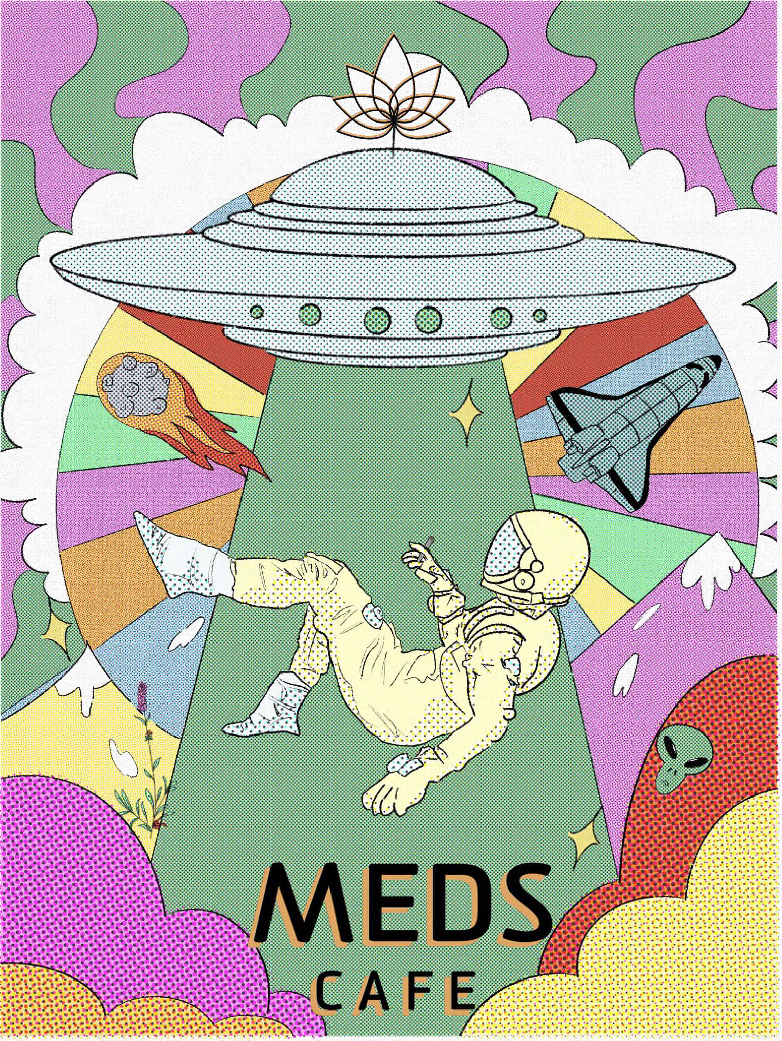
There was also a necessity for better brand recognition through print products as well, as opposed to strictly digital assets. An illustration was created in an effort to follow previously existing brand guidelines, but also expand on the "key signature look" that many cannabis brands tend to follow; for instance, the astronaut symbol was a particularly important focal point of this piece, but it was also important to include the lotus flower of the Meds Cafe brand.
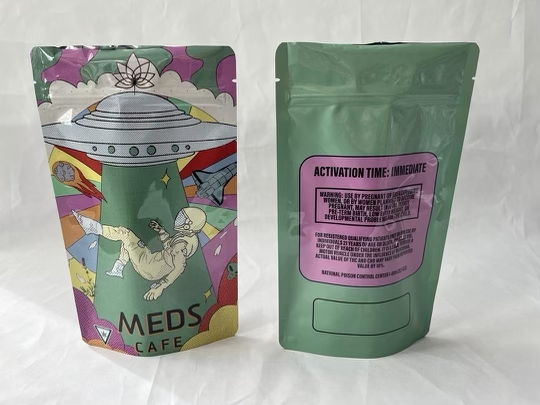
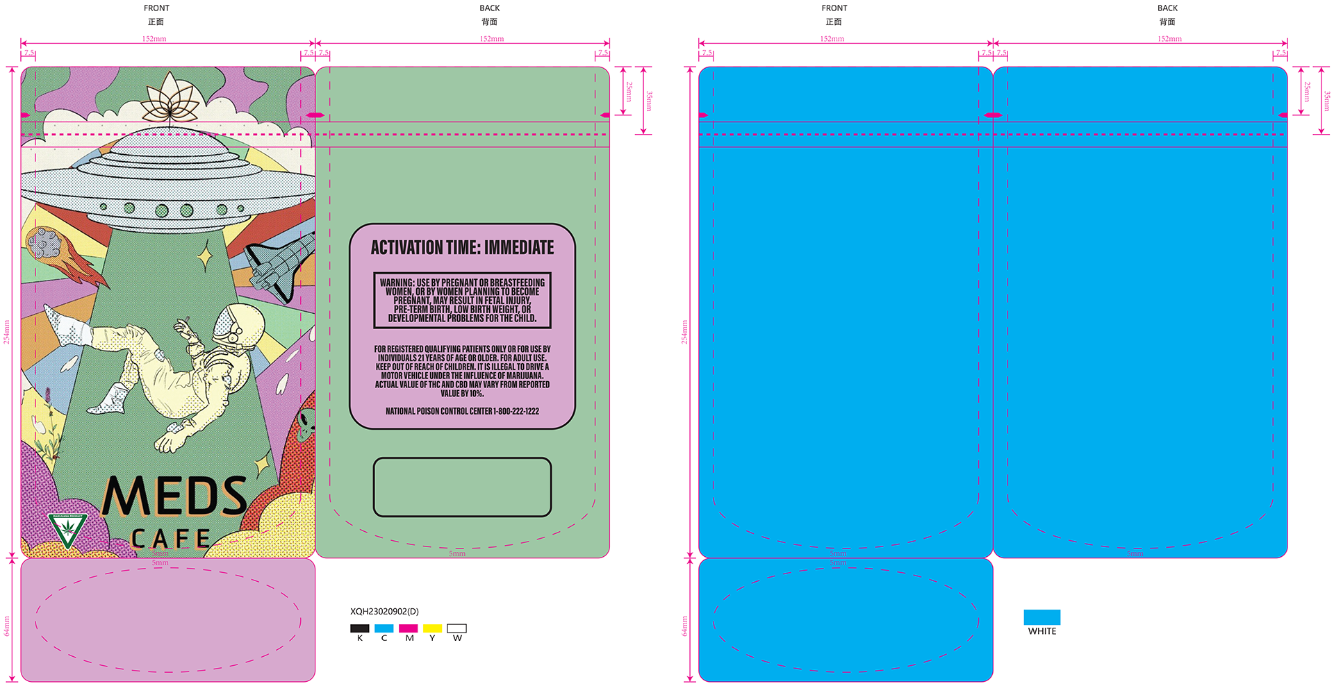
The piece took inspiration from large t-shirt murals oftentimes found at various music festivals, as well as the "trippy" designs that frequent a lot of cannabis advertisement. In the end, the illustration was approved, and a vector was sent out to produce the first official "Meds Cafe" branded mylar bags.