
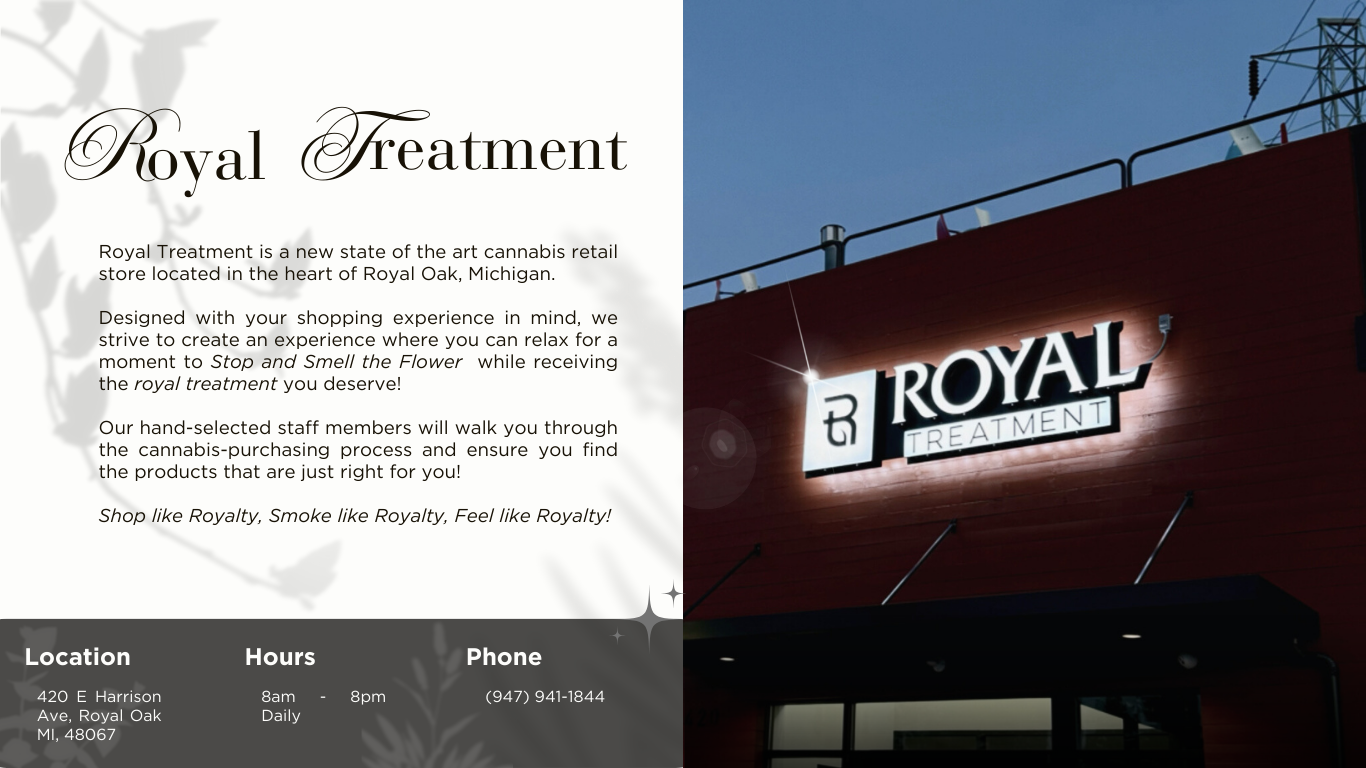
While boasting the title of the "First Dispensary of Royal Oak," Royal Treatment attempted to expand and revolutionize their online presence in an effort to drive engagement and boost sales. As is the case of many dispensaries, certain city ordinances prevent explicit advertising and limit marketing capabilities; by improving e-commerce sites and incorporating professional product photos, SEO and online engagement could increase, thus improving online and in-person traffic to the store.
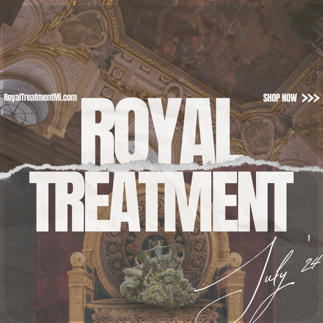
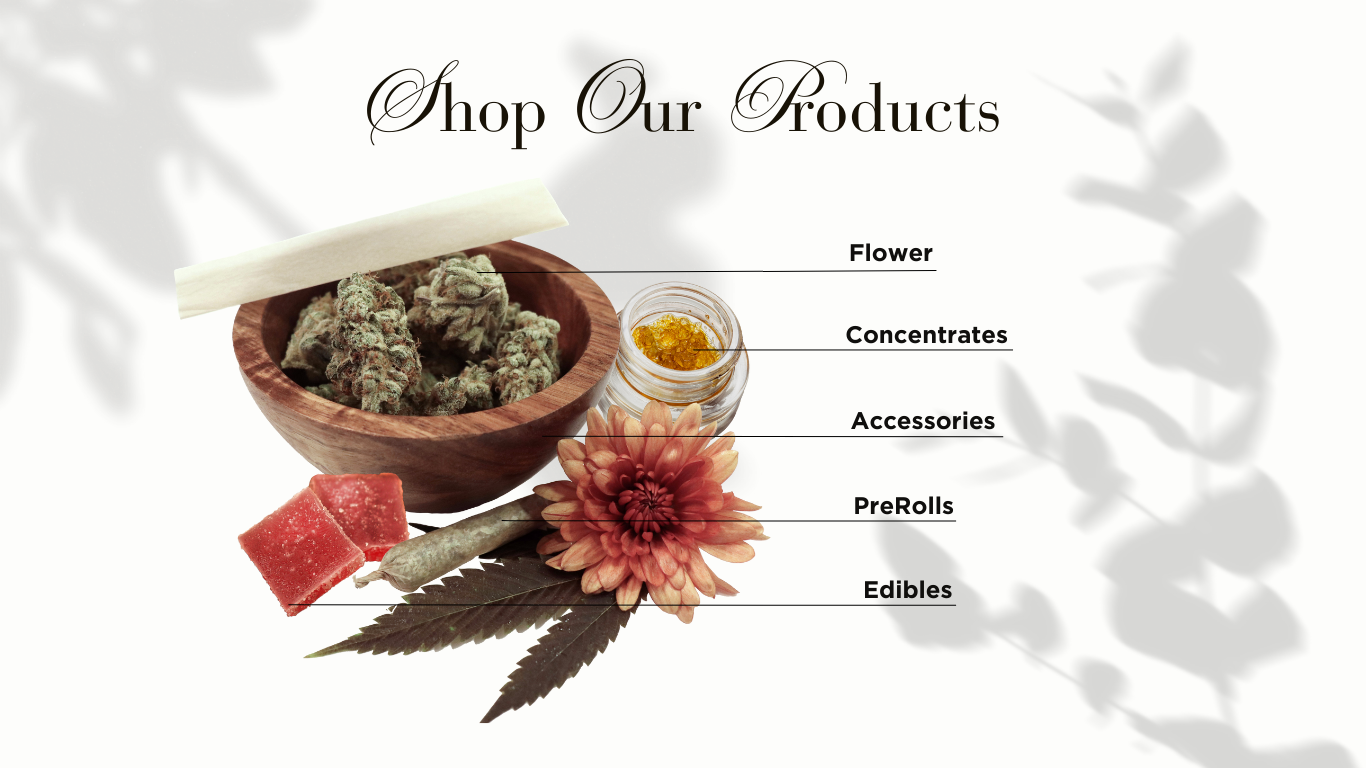
The first step was creating a universal brand image for online marketing; a product photo template. Located in Royal Oak, the goal was to create an image that boasted elegance, luxury, and sophistication. Following in the footsteps of the previously designed Royal Treatment logo (black-and-white minimalism with an allusion to leaves and plant-life), as well as the inspiration of luxury jewelry product photography, the end result incorporated a black-and-white base with key greenery elements.
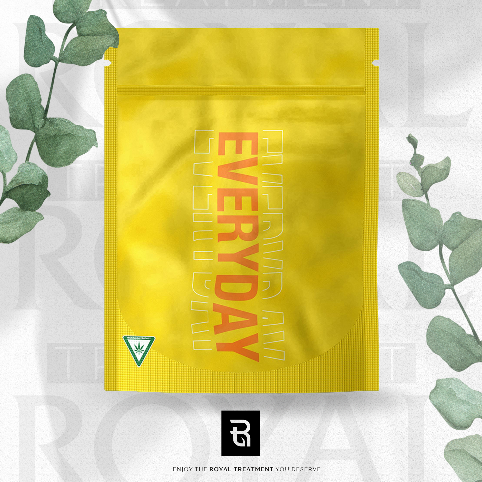
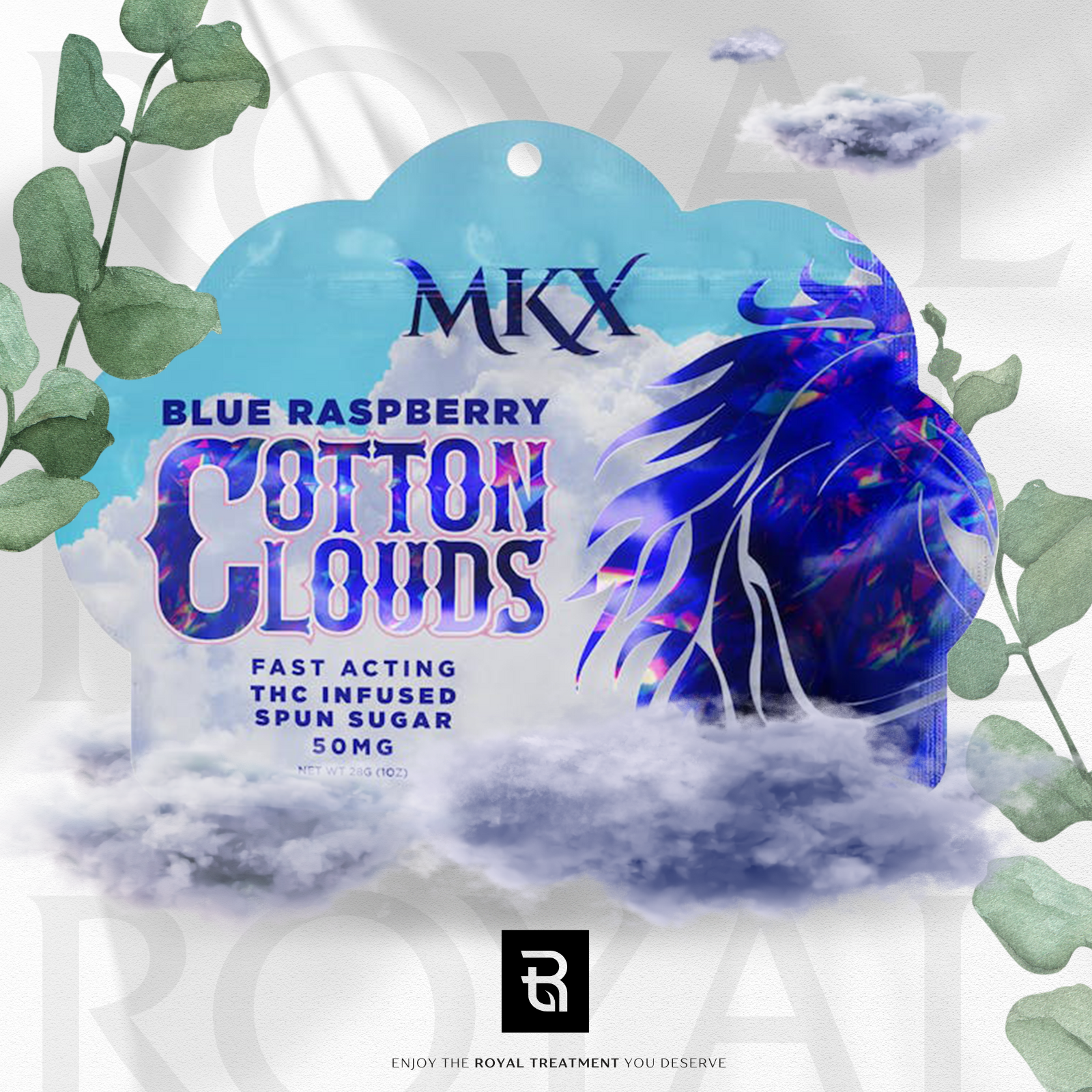
Overall, the marketing efforts were integrated onto the Weedmaps website, providing a cohesive and branded menu that improved the 'Weedmaps Menu Score' and allowed SEO improvement through one of the largest cannabis community sites online. Along with the photos, extensive research was conducted between brands and companies in order to provide additional product information and descriptions to assist in boosting SEO and customer engagement.
Along with the e-commerce design, multiple marketing assets were also created and pitched, awaiting assessment and approval for further use.
These assets include potential Instagram posts, stories, and printed materials (subject to online cannabis policy changes prior to social media usage).
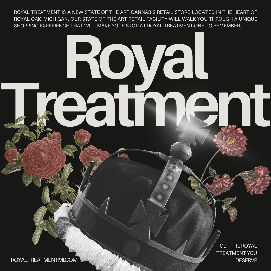

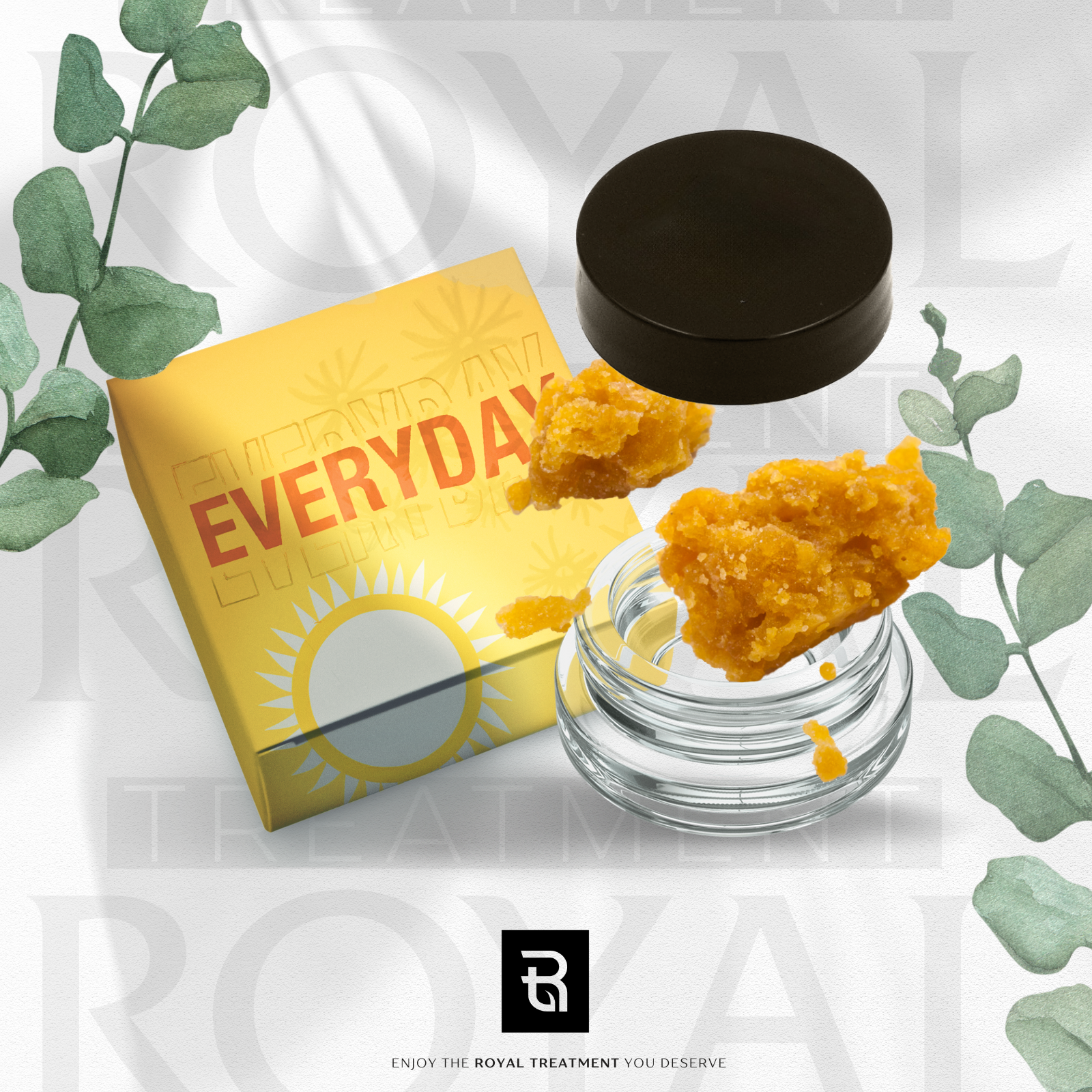
Photo Manipulation base

First step of Photo Manipulation; added additional assets (bees, wax pucks, concentrate cluster)
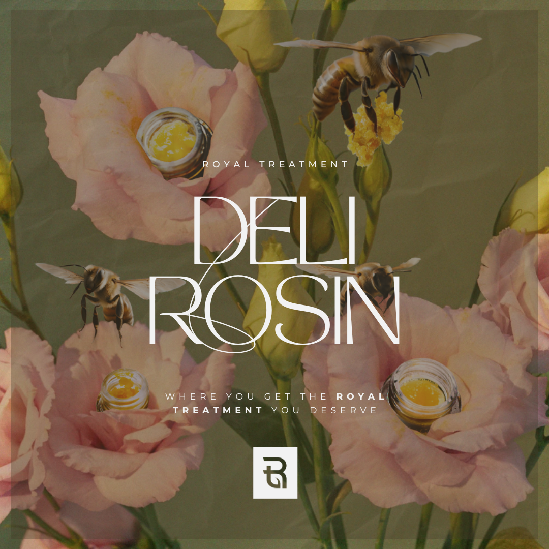
Final rendering of Photo Manipulation for online usage.
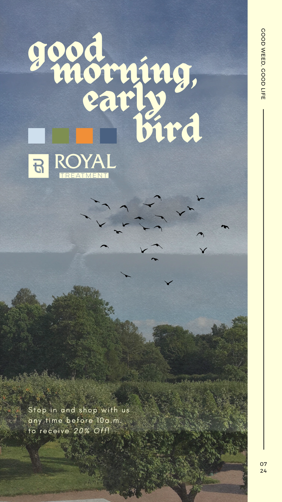
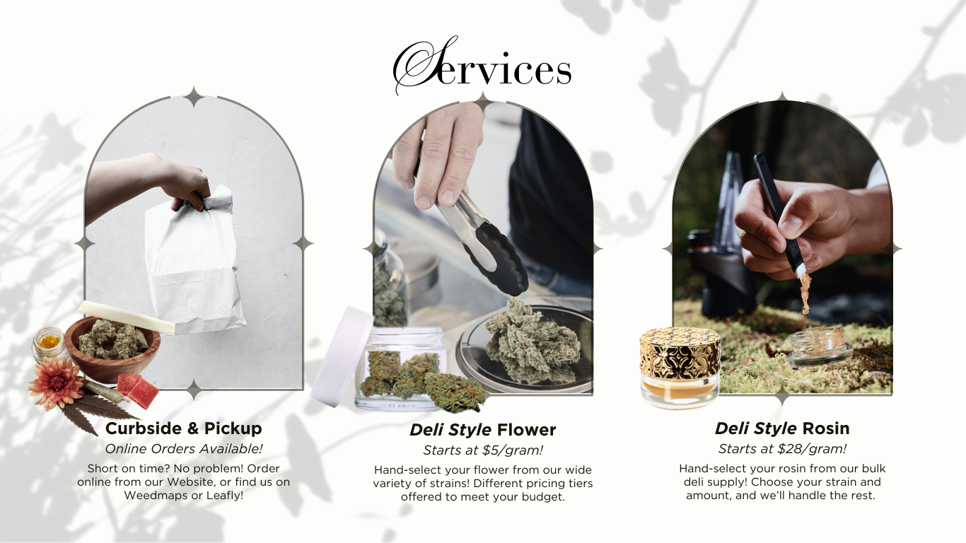
Various marketing tools and assets were created and designed with sales optimization in mind. The focus was on highlighting key differences at Royal Treatment that are unique and not universally available at other surrounding dispensaries in the area. By doing so, it provides a unique customer experience, driving traffic to online sites and improving in-person foot traffic in stores.
A key facet of the store's operation involves the early opening time; as stated by multiple customers, the opening time was a rare commodity in the area, and oftentimes a key factor in choosing this location for shopping. Creating assets that highlight this element was important.
Lastly, an improvement in the store's overall website design was necessary; although not yet implemented, a redesign pitch is ready, intent on improving user experience and ease of use online.
Following earlier design criteria, it was immensely important to create a design that highlighted the elegance and luxury of the Royal Treatment brand image.
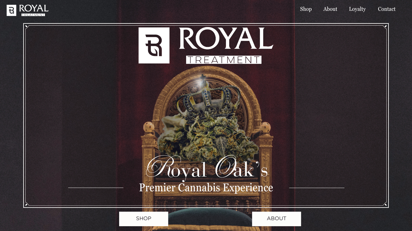
All design elements were hand-selected and manipulated to better reflect the overall Royal Treatment brand message. A basic design template with hopes of expanding in the future.